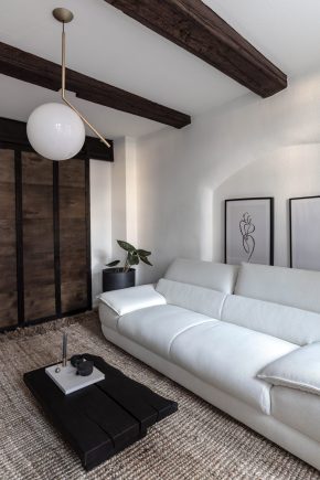
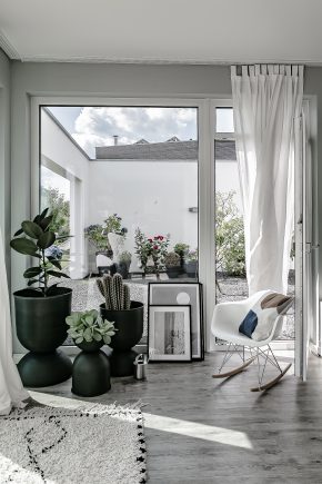
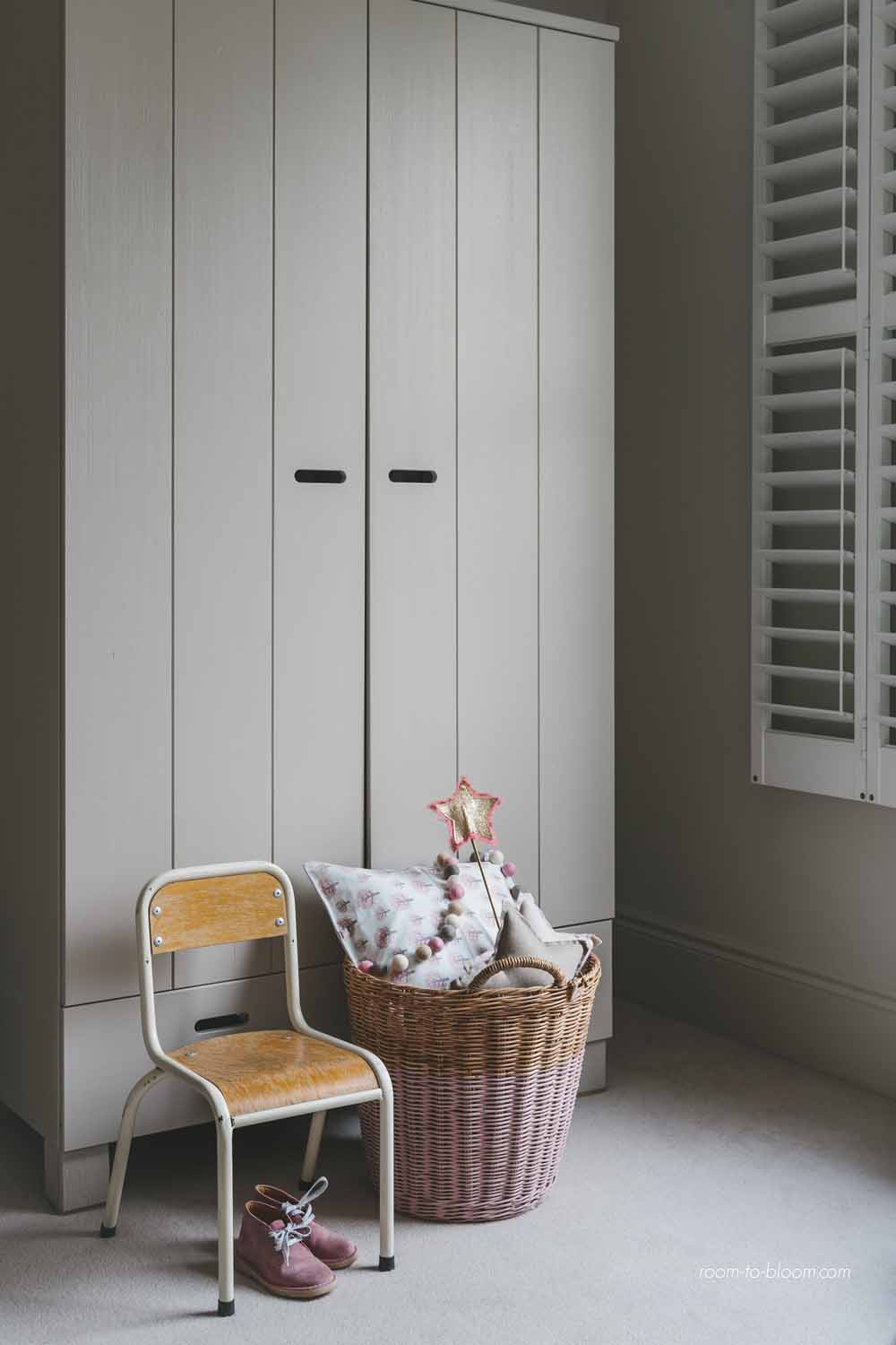
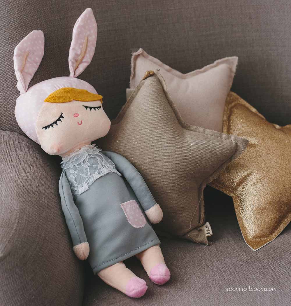
Soft, dusty vintage inspired French colors, Scandinavian monochrome & fresh pastels.
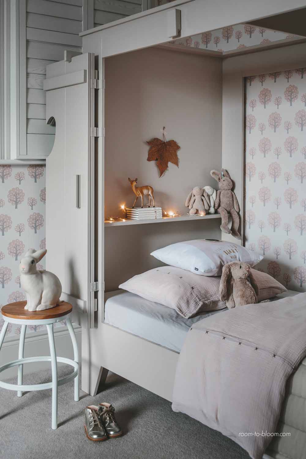
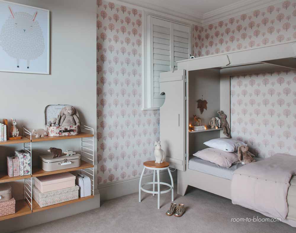
 Among all the interior decoration projects, the one I find to be one of the most challenging is the interior design for children’s rooms. While there are so many inspiring styles, catalog pictures and designers for kids, the challenge that remains is meeting the reality of childhood and our styling expectations. If you are a parent, you probably know what I am talking about: the bitter truth of what is left from our decor after our children start to use their fresh designed rooms.
I sat today for Q & A Chat on this subject with three wonderful inspiring ladies – Helena Casanovas & Patricia López from Spain – the creators of a major interior design for children inspiration platform Petit & Small and a miracle worker interior designer for children’s rooms from UK Ursula Wesselingh from Room To Bloom.
Q (Designsetter): The first question which arises is how do we know before starting with children room design project, what will make our children happy in their interior space. A baby or a 2 year old child cannot yet verbally express his/her decoration wishes. So how do you start with a design project for such small ones?
Ursula Wesselingh: You start with yourself, there’s no other way. For nurseries I always say, make it feel like a place you want to spend time in. It needs to be functional, obviously, so you’re not struggling with nappies and your baby gets the sleep he/she needs, but definitely make it beautiful – whatever that means to you. I really believe that aesthetic preferences are learnt – a lot of my design „loves“ are connected to memories of the home I grew up in – so by following your own style when decorating your child’s room in the early years, you’ll be setting an example. As they grow older, their own personality and developmental needs will come into play more and more, but up to around 10 years I still think you should take the lead in creating a base decor that is harmonious and forgiving: storage and a reduced base color palette go a long way in keeping a room looking stylish no matter how much stuff gets piled in. That doesn’t exclude your child’s freedom to personalize their space and make it their own. The most important thing is to create a space that both you and your child take pleasure in. Paying attention to their room decor, with little personal touches, handmade projects, makes kids feel important and loved.
Q (Designsetter): This is a more psychological and not an easy question. How, in the process of kids rooms decoration, can we distinguish between our own stylistic wishes and those which will make our children happy?
Ursula Wesselingh: I think that when you take an active interest in the decoration of their room – as described before, by taking the lead in making it an important space and coming up with ideas to always make it nice, change it up a bit, make it cosy, making things together, – rather than a reactive approach („Mum I want a disney duvet – no you can’t but you can have this instead“), there will a higher chance of your child’s and your stylistic wishes coinciding. Don’t take me wrong – I definitely think that children’s rooms should be child-friendly, and so will look very different from our own bedroom or living room, but I think it’s not difficult to create a child-friendly room that also pleases the parent. I’m not proposing there’s no room for dinosaurs for example, if that would make your child super happy – but you might go for a single large dinosaur wallpaper silhouette designed by Inke for example that can be removed when the interest passes, or choose a feature wall in a sophisticated colour green or earthy colour and have a display ledge showing off a dinosaur figurine collection, which can easily be replaced by something else in the future. Those things would fit in with my idea of style, but definitely belong in kids’ rooms rather than my own bedroom.
Patricia: We must get a balance, especially during the early stages. I’m afraid that all of us know who put the rules in the room’s decor from the preadolescence.
When they are little we can decide but we must also consider their own tastes and adapt their room according to them. What’s their favourite colour? Do they love reading books? Do they prefer drawing in a creative place? Anyone knows our kids as we do. Decoration and room’s distribution can support them and promote their skills but they are also really useful to develop great things inside them while they are stimulated. A very intimate place to read their favourite books? Hangers placed at the same height as them to teach them how to organise their clothes? There are lots of options…
Helena: I love the idea of decorating the room step by step. On this way you can identify your kid’s needs and what do you like. Leave free space on the wall to hang a wonderful drawing made by your child or an object with a special meaning for him. If you like minimalism, you don´t have to fill the whole room with things but every single included element has to be loved for your kid and you.
Functionality and a funny touch are also a must to decorate a kids’ room.
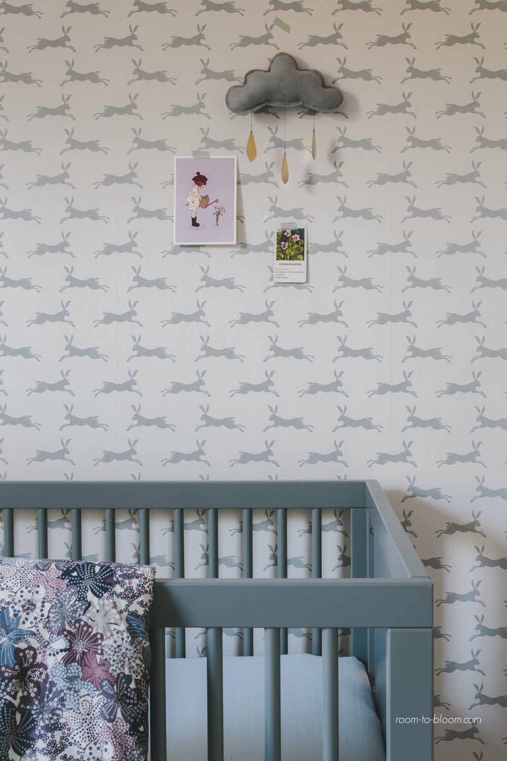
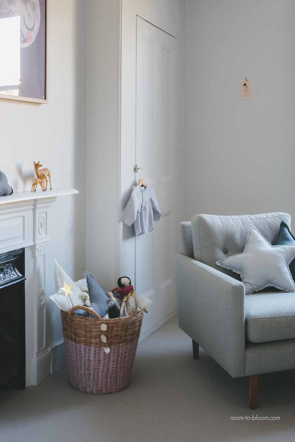
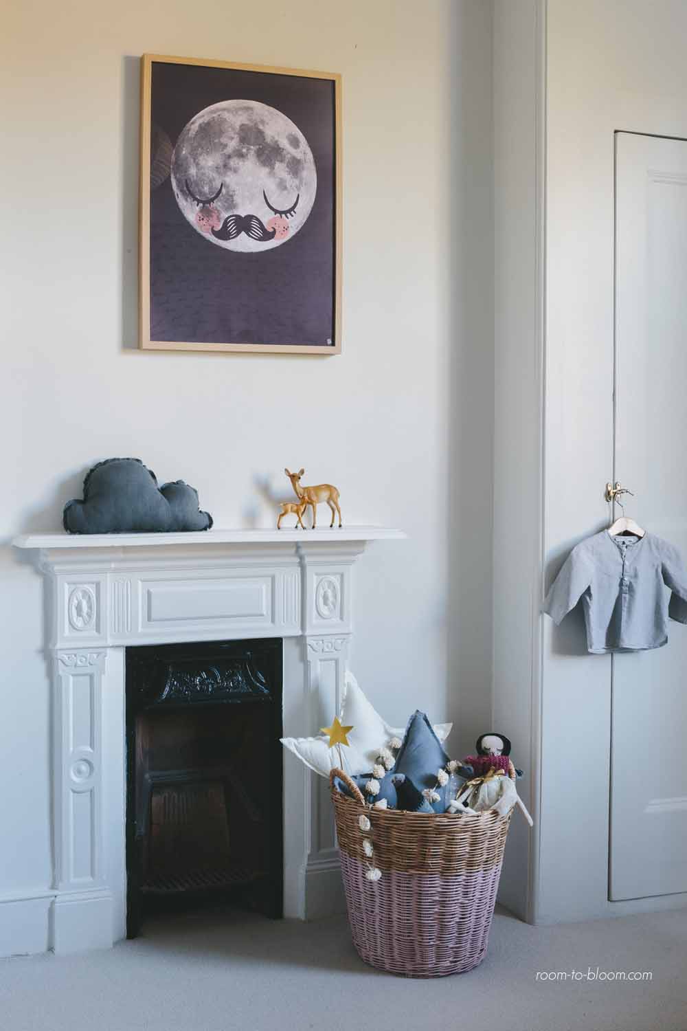
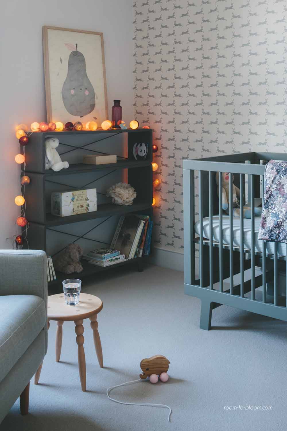 Q (Designsetter): Petit & Small Team, You spend your days looking at beautiful pictures of well designed child rooms to find inspiration for your blog. So how do you think we can enjoy good design for our homes and create kids rooms for our children where they feel comfortable in their space at the same time?
Patricia: Nowadays, decoration is much more respectful with kids, with their essence. Until a few years ago, aesthetics was above kids’ daily reality but today-fortunately- this is not like that. We enjoy every day while we see those rooms plenty of life. Trend is a bit messy order where not all the pieces of furniture share the same colour and the pictures are not perfectly lined up. Kids are “recovering” their space.
Helena: It’s true, in Petit & Small, we spend a lot of time looking for beautiful, well designed, funny and kid-friendly rooms. Kids also can enjoy a well-designed product or a room with a good distribution with witty and functional solutions but with a great space to develop kids’ creativity at the same time.
It’s the same with toys, books, furniture…kids are people and they can be treated as intelligent beings by designers, writers, and illustrators although they have to adapt their creations to kids’ age and size, of course.
This doesn´t mean that rooms must be designed only according to parents’ point of view and tastes. Kids are the users and we have to consider them if we want they to feel that space as an own place.
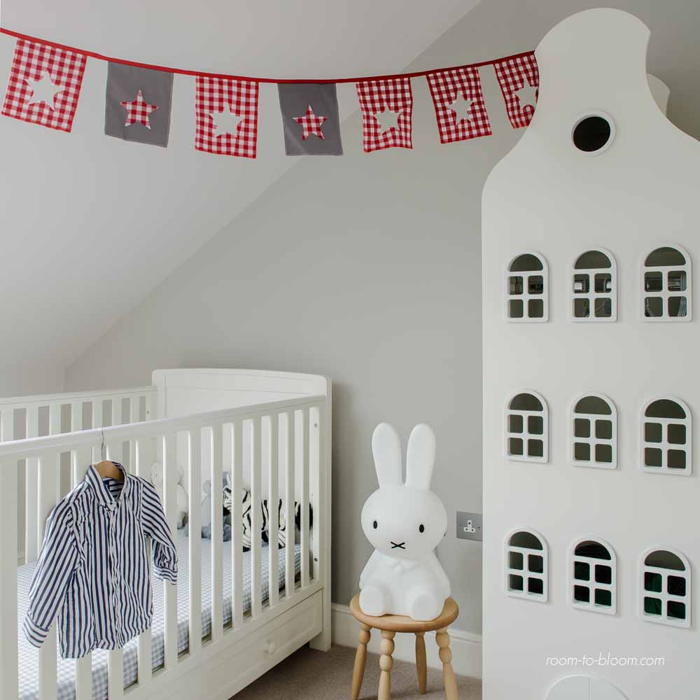

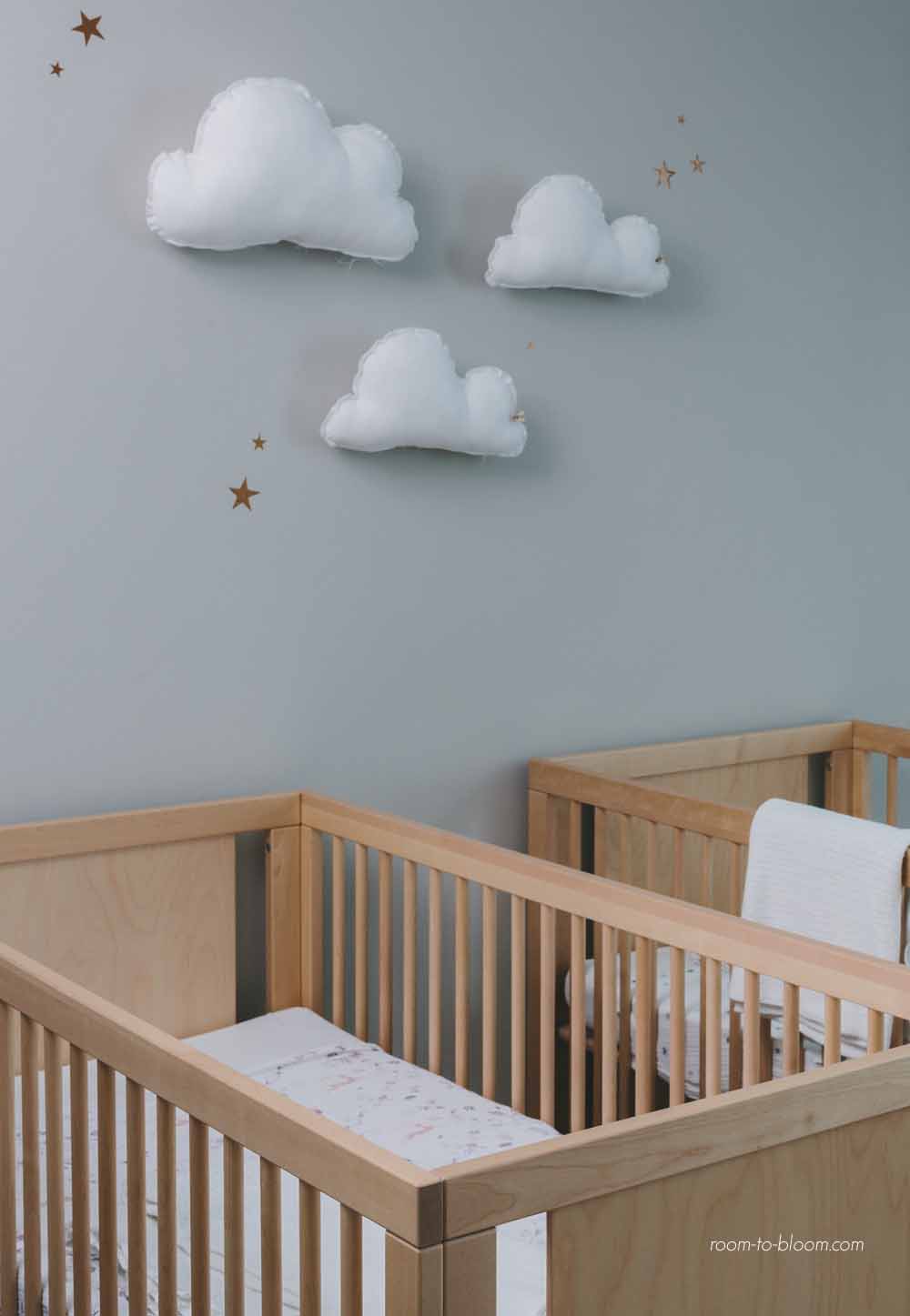
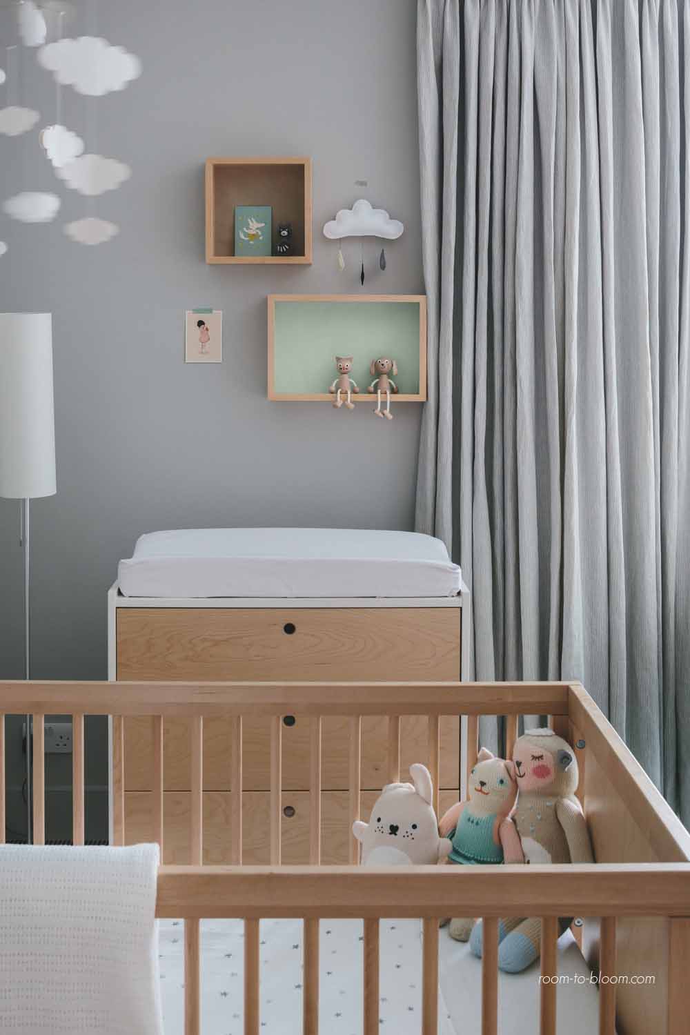
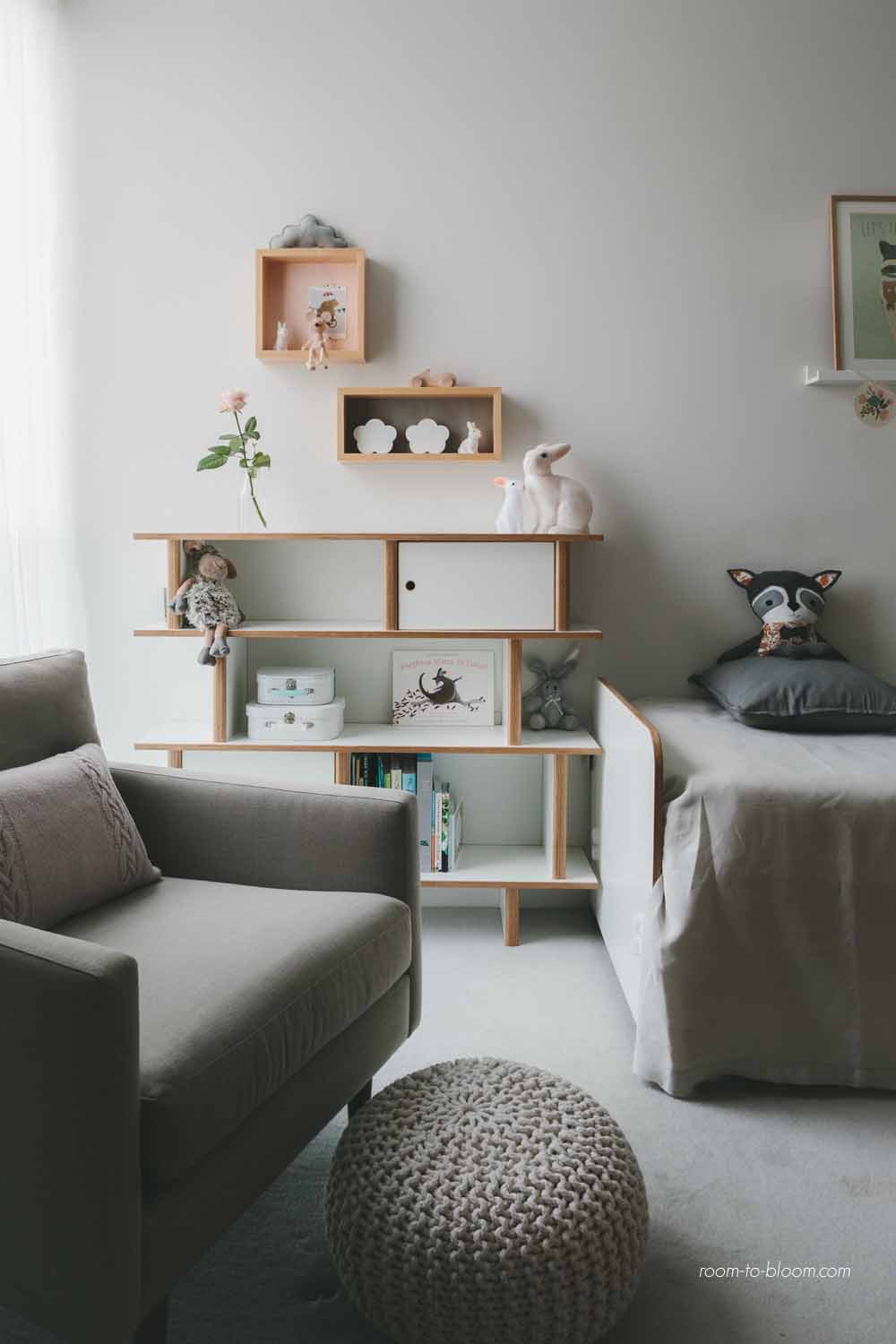
Q. Designsetter: Lets talk style. What are the current trends in children room decor and what are these trends communicating?
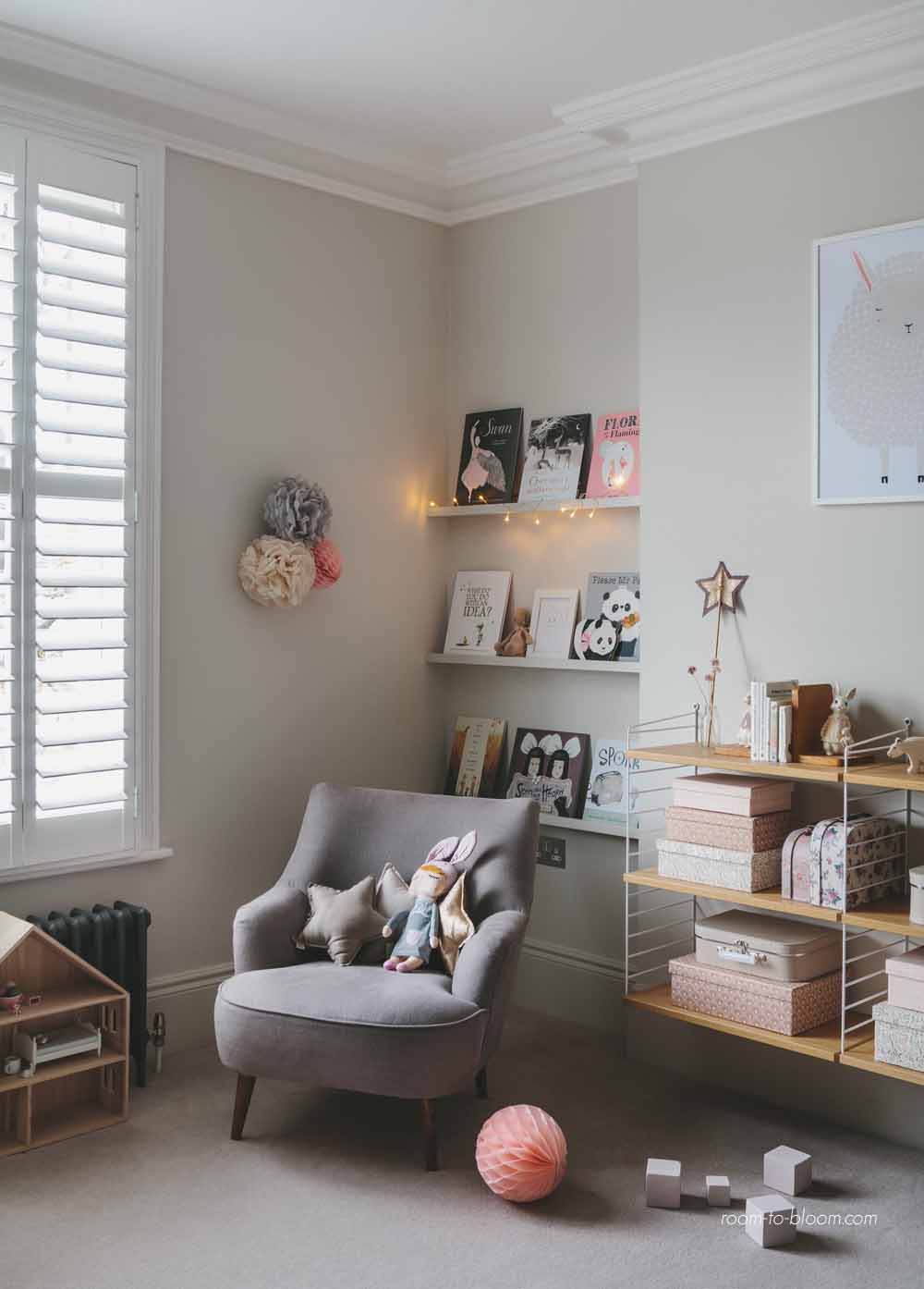
Ursula Wesselingh: I see two main colour trends: the soft, dusty vintage inspired French colours that started with Numero 74 and the more Scandinavian monochrome & fresh pastel trend. They seem to me a reaction in opposite directions to the same thing: an uncertain, ever more complicated world, economic recession, political instability, a loss of control. The vintage dusty colours seem to be part of a romantic inspiration, a harking back to the past, looking for comfort in the safety of our childhood perhaps, of better, simpler times. The clean monochrome trend, often enlivened by fresh pastels and ice cream colours, is the opposite reaction to the same uncertain world – the same longing for simplicity, but looking for solace in a brighter future, with hope and uplifting colours as an escape from dreariness and uncertainty.
Helena: There isn’t only one décor trend, they coexist with different spaces. It´s true that Scandinavian style has won lots of supporters since several years ago, this is not strange! They are rooms plenty of light, comfort and simplicity with a functional touch. We can also see monochrome rooms where black and White where black and White and graphic touches play a crucial role.
But there are also families who prefer a more eclectic decoration. They mix vintage and modern objects, play with colours and textures and they create magic and very personal rooms.
Pinterest, Instagram and specialized blogs are a great source of inspiration. I think they have a very important role in trends’ spreading and also in new products’ findings. Obviously, there are also many printed magazines, professional fairs, etc. But the final user is closer to all that decor information and it also offers more options.
Patricia: Trend is linked to eclecticism, mixes where every kid and every family define their decor pattern. We have a clear influence of Nordic and French-vintage styles. We are coming back in time, we want to recover that feeling of “cosy home” where not everything is new and luxurious but always comfortable. In this sense, we can find lots of mums recovering old furniture, big wooden wardrobes…Antique markets are living their best times
Q. (Designsetter): Which trends you adore the most?
Ursula Wesselingh: I personally love the vintage trend – but I’ve always been a fan of incorporating vintage furniture in my designs and my own home. I’m one of those people who can’t go past a skip in the street without looking if there’s treasure in there. My sisters and I had old wooden beds in our rooms, and I love combing through flea markets. I do also like the soft dusty colours that are so popular right now, though as a designer I’m led by my clients’ brief and the conditions of the space itself, and I’d say I’m not particularly trend led in my approach.
Helena: Choosing is difficult; Petit & Small tries to show a huge variety of styles. Nordic, vintage, minimalist, Bohemian…I don´t think there is an only ideal room, there are lots of them. It depends on the house, the family’s lifestyle, the available space, the kids’ hobbies…
Patricia: Personally, I really love Nordic atmospheres where distressed and natural materials are mixed with some modern designer pieces. Natural branches and logs connect us with nature. There are big walls shared at the same time by posters which have been created by famous illustrators and our own kids’ drawings…it’s something like the new trendy face of traditional things.
Q. (Designsetter): How can we have the balance of knowing what inspiration to draw from the trends, and what to apply from it to fit the personality of our children?
Ursula Wesselingh: I think that’s easy – you know your child and know instinctively what fits with their personality – that’s the bits you apply. You also know instinctively the difference between trying to copy a certain look that you enjoy on Instagram and imposing that on your child’s space, or whether it’s something that you genuinely think they will enjoy too.
Helena: This is a main point. When they are still babies, parents can design the room according to the style of rest of the house. But in a short time, they will also decide and choose a colour although we don´t always agree with their options… isn´t it?
I think we have to consider their personality and tastes because this is the only way to make them feel happy in their space. However, this doesn´t mean that you must fill the whole room with Frozen, Mickey and all of that. You must also offer them quality products and find a solution which can be adapted to both kids and adults.
For example, if you have a two-year old kid you can´t expect to have an organised room all the time or that he will be careful with that delicate and expensive piece. You can find storage solutions to ease everybody’s lives: well-designed chairs and desks designed according to their size in order to promote their autonomy or look at him while he is enjoying a witty toy.
Patricia: Kids’ room and its decoration must be chosen according our possibilities. It should be a reflection of our personality and our kids’ lifestyle. Firstly, they must feel that that is their space and, according to their maturity, take part in the election of the decoration. There are many ideas and lots of beautiful styles; however, any decor is going to be a success if the kid is not identified with it.
Q. (Designsetter): In contrast to trends, are there timeless themes and elements in children decor that you have noticed?
Ursula Wesselingh: Nature and animals seems to be a particularly enduring one. There are definite trends in which animals are the favorites (for example the owl and then fox a while ago, and now the raccoon), but in general flora and fauna seem to come back again and again. It’s easy to see why – animals are such an important part of learning about the world around us in the early years, and as adults is still easy to relate to as they are animate, easy to project our feelings to – and look cute! On the other hand there are elements that relate to the practical need for enduring, economical décor (contradictory as that may sound), such as natural wood and white furniture, because people find it versatile.
Patricia: I love soft tones and simple motifs. A sober and neutral decoration can be updated with some touches like the furniture, textiles and accessories…in order to adapt it to every kid’s phase. Trends are always changing, at least the major part of them, however, balance and aesthetics are timeless concepts
Helena: The main elements are a good bed (or coat), wardrobe and storage solution. And always, lots of light in the room.
Q. (Designsetter): I have made the experience that in decor, it is better to begin with a muted color like gray or pastel hues as a base color and then add contrast colors is a wonderful method for decoration. You mention also starting with a reduced color palette. What are your favorite color combo choices for kids rooms from all the beautiful examples you see?
Ursula Wesselingh: My eye is drawn to grey and neutral schemes, natural wood, and colour groups like ochres & gold, pink, mauve and violets, blues and greens. I also like moody dark blue and grey schemes, but think they are better suited to pictures than reality. To create restful bedrooms, I go for a reduced palette as it forms a calming background to colourful toys and other belongings as you say. Any colours other than white also have the benefit of visually tying things together. I deliberately reduce contrast in my designs by choosing different tones of the same base colour for walls & woodwork, furniture and window treatment, with usually one accent colour or dominant material/finish.
Helena: I love your idea. Starting with a soft base like grey, pastel or white and adding touches of colour ( in accessories, bedding, toys and posters) allows to create a peaceful and joy at the same time. You never get tired it and, furthermore it can be adapted according to kids’ evolution with a simple change of accessories.
This is also a good option to create the balance among parents and kids’ tastes, don´t you think? Maybe your child loves pink or green…you can add a touch of that color without getting an excessive result for adults.
Patricia: As it happened with trends, my opinion about this also changes with time. Nowadays, I love grey, white and wood, it’s elegant and cosy! Colour is always present in a kids’ room with posters, toys, clothes…
And what questions arise for you when thinking about Interior design for children’s rooms? Leave your comment bellow or discuss it on our twitter chat.
The Pictures for this article are kindly provided and copyrighted by Ursula Wesselingh from Room To Bloom
I am absolutely in love with her Project Charlotte’s Room…and what is your favorite?
For more inspiration for Interior design for children’s rooms check our pinterst walls:
Designsetter’s Children’s Rooms / Room To Bloom & Petit and Small


